
The Complete Guide to Gallery Wall Layout
Last Updated: 27 October 2026
Quick Summary
A gallery wall layout is the planned arrangement of framed pieces across a wall, built around a 145 cm centre line, consistent 2-3 cm gaps and coverage of 60-75% of the space above your furniture. Plan the whole layout on paper before drilling any holes.
- Mark a centre line 145 cm from the floor as the spine of the arrangement.
- Keep gaps between frames within 2-3 cm and hold that figure everywhere.
- Span roughly 60-75% of your furniture's width with the arrangement.
- Leave 15-25 cm between the lowest frame and the top of a sofa or sideboard.
- Stand one metre back to check the paper templates before drilling.
Table of Contents
- Why Gallery Wall Layout Matters More Than the Art Itself
- The Core Measurements Behind Every Gallery Wall Layout
- Choosing a Gallery Wall Template That Fits Your Space
- Gallery Wall Spacing Rules That Keep the Arrangement Balanced
- How to Hang a Gallery Wall Without Damaging Your Walls
- Gallery Wall Ideas for City Prints and Travel Collections
- Matching Frames, Art Styles and Room Proportions
- Common Gallery Wall Layout Mistakes to Avoid
- Planning Your Gallery Wall With Your Urban Canvas Prints
- Frequently Asked Questions
Why Gallery Wall Layout Matters More Than the Art Itself
A gallery wall layout is the planned arrangement of framed pieces across a wall, defined by a centre line, consistent gaps and a shape that suits the space. Get that structure right and modest prints look considered. Get it wrong and museum-quality art looks like clutter.
There is a reason layout deserves this much attention. A wall arrangement is read as a single object before any individual piece is examined. Your eye registers the overall shape, the rhythm of the gaps and the alignment of the edges first. Only then does it move to the Hungarian Parliament or the Sydney Opera House inside a frame. If you want to understand the craft behind the city artwork so you can choose pieces worth building a layout around, read how I create a city artwork. If the overall shape is chaotic, the eye never settles long enough to appreciate the detail.
The good news: layout is learnable. It follows measurements, not taste. Below, we break down the exact numbers, the templates that work in real rooms, and the mistakes that undo an otherwise beautiful collection.
The Core Measurements Behind Every Gallery Wall Layout
Three numbers govern almost every successful arrangement: a centre height of 145 cm from the floor, gaps of 2-3 cm between frames, and coverage of 60-75% of the space above your furniture. These figures come from practical layout guidance published by Inkaarthouse's 2026 gallery wall guide, and they hold whether you are hanging three prints or twelve.
The 145 cm centre line is the one people get wrong most often. It approximates average eye level, so the middle of your arrangement sits where a standing viewer naturally looks. Measure 145 cm up from the floor, mark it lightly in pencil, and treat that as the spine of the whole wall. Every template below is built around it.
The 2-3 cm gap is tighter than most people expect. Beginners leave 10 cm or more between frames, which breaks the arrangement into isolated islands. A consistent 2-3 cm gap lets separate pieces read as one composition. Pick a figure within that range and hold it everywhere, including between rows.
The 60-75% coverage rule applies to the wall area above a sofa, sideboard or bed. If your furniture is 200 cm wide, the arrangement should span roughly 120-150 cm. Too small and the art floats; too large and it crowds the edges of the room.
| Measurement | Recommended figure | What it controls |
|---|---|---|
| Centre line | 145 cm from floor | Vertical placement of the whole arrangement |
| Frame gap | 2-3 cm | Whether pieces read as one composition |
| Coverage above furniture | 60-75% of furniture width | Scale of the arrangement in the room |
Choosing a Gallery Wall Template That Fits Your Space
A gallery wall template is a preset arrangement pattern, and the right one depends on how many pieces you own and how much wall you have. Pick the template before you buy frames, not after. Retrofitting a collection into a template rarely works.
Here is how we would choose, room by room:
- Small wall, three to five pieces: a single-row grid or a simple centred column. Keep it tight and resist filling the whole wall.
- Wide wall above a sofa: a symmetrical grid in two or three rows, aligned to the 145 cm centre.
- Awkward wall with a radiator or sloped ceiling: an asymmetrical salon arrangement that flows around the obstacle.
- Rental with a picture rail: lean, do not hang. More on that below.
Grid, Salon and Asymmetrical Templates Compared
The grid is the safest template and the easiest to hang: equal frame sizes, equal gaps, aligned edges. It suits architectural prints particularly well because the discipline of the grid echoes the discipline of the buildings.
The salon style, sometimes called a salon hang, stacks mixed sizes from a central point outward until the wall is filled. It looks collected rather than planned, which is the point, but it demands more pieces and more patience.
The asymmetrical template is a controlled version of the salon: a strong anchor piece, usually larger and placed slightly off-centre, with smaller frames balanced around it. It works best on walls where a symmetrical grid would fight the architecture.
| Template | Best for | Pieces needed | Difficulty |
|---|---|---|---|
| Grid | Uniform prints, small walls | 3-9 | Low |
| Salon | Mixed sizes, period rooms | 8-15 | High |
| Asymmetrical | Awkward walls, anchor piece | 4-8 | Medium |
One trend worth noting: Rossetti Art's 2026 outlook describes a shift toward more curated, less cluttered walls, recommending 5-7 intentional pieces rather than a densely packed wall.
Gallery Wall Spacing Rules That Keep the Arrangement Balanced
Gallery wall spacing is the consistent distance between frames, and it should stay within 2-3 cm across the entire arrangement. Consistency matters more than the exact figure. An arrangement with uniform 3 cm gaps looks calmer than one with gaps ranging from 2 cm to 8 cm.
Three spacing rules do most of the work:
- Hold the gap constant. Measure it once, cut a spacer from card, and use it for every frame.
- Treat the group as one rectangle. The outer boundary of the arrangement should form a clean shape, whether that is a rectangle, a square or a deliberate organic outline.
- Keep the centre line true. The midpoint of the arrangement, not of any single frame, sits at 145 cm.
Spacing also governs how the arrangement relates to furniture. Leave 15-25 cm between the bottom of the lowest frame and the top of a sofa or sideboard. Closer and the art feels like it is sitting on the furniture; further and the connection between wall and room breaks.
Watch out: the most common spacing failure is measuring gaps between frame edges but forgetting the white border inside each print.
How to Hang a Gallery Wall Without Damaging Your Walls
Hang a gallery wall without damage by planning on paper first, marking positions with removable templates, and drilling only after a one-metre check confirms the arrangement reads correctly from a standing distance. The whole process takes an afternoon for most walls.
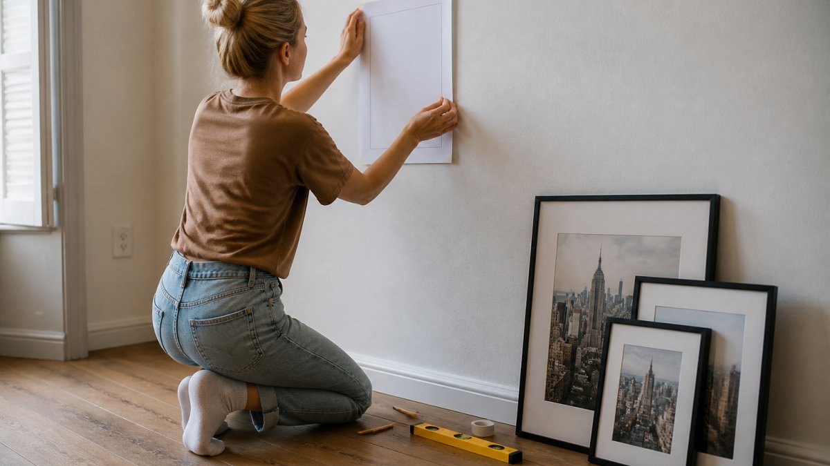
Start by cutting paper templates to the exact size of each frame, including the frame itself. Tape them to the wall using the 145 cm centre line and your chosen 2-3 cm gaps. Step back frequently. This stage costs nothing and prevents every hole you would otherwise regret.
Paper Templates, Pilot Holes and the One-Metre Check
The one-metre check is simple: stand one metre back from the wall and look at the paper arrangement without judging individual pieces. Does the overall shape feel balanced? Does it sit comfortably above the furniture? Adjust the templates until the answer is yes, then and only then reach for the drill.
When you do drill, use a pilot hole first, sized to your wall plug, and mark the hanging point on the template rather than guessing from the frame. Most frames arrive with hanging hardware included, so check the position of the fixing on the back of the frame and transfer that measurement to the template.
Personalised Budapest Cityscape Print | Subtle Title →
For renters or anyone unwilling to drill, two options work well. Command-style strips suit lightweight frames on smooth paint. Leaning is the other route: Inkaarthouse's layout guidance describes leaning framed prints on a picture rail or a long shelf as a leading option for 2026, using one or two shelves at different heights. It is renter-friendly, easy to rearrange, and it suits city prints particularly well because the shelf becomes part of the display.
Gallery Wall Ideas for City Prints and Travel Collections
Travel collections have an advantage most gallery walls lack: built-in narrative. A wall of cities you have lived in, visited or left behind carries meaning before anyone reads a label. The layout should support that story rather than scatter it.
A chronological or geographic approach can work well. Line your cities up in the order you encountered them, or group them by continent, and let the arrangement do the storytelling. A subtle-title print style keeps the focus on the architecture; a bold typography style turns each city name into a graphic element in its own right.
iCanvas's 2026 wall art trend notes describe colour-blocked gallery walls as a modern evolution of traditional layouts. For a travel wall, that could mean grouping warm-toned cities together and cooler-toned cities together, so the arrangement reads as two deliberate blocks rather than a random mix.
If you want inspiration for curating a wall around the places you have lived and loved, our guide to curating your wall like a postcard walks through building a travel-themed collection piece by piece.
A practical note on mixing: keep one variable constant. If your cities vary in colour and subject, hold the frame style and size consistent. If you want mixed frame sizes, keep the print style consistent. Varying everything at once is what makes travel walls look like souvenirs rather than a collection.
Matching Frames, Art Styles and Room Proportions
Frame choice is a proportion decision before it is a colour decision. A thin frame on a large print looks underfed; a heavy frame on a small print looks like it is swallowing the art. As a working rule, frame width should scale with print size, and the frame colour should either match the room's dominant metal or sit deliberately apart from it.
Our frames are made from durable pine in four colours, with shatterproof acrylic glass and hanging hardware included. If you are weighing a subtle, fine-art treatment against a bolder graphic look, you can compare the subtle title print style with the bold typography print style before committing to a whole wall.
Room proportions matter as much as frame proportions. A high-ceilinged room can carry a taller arrangement; a low ceiling wants a wider, shallower one. In a hallway, keep the arrangement narrow and vertical so it does not compete with the walls closing in on either side.
Where to hang matters too. Above a sofa, centre the arrangement on the sofa, not the wall. In a home office, place the centre line slightly higher if you mostly view the wall standing, or at 145 cm if you view it seated. Small adjustments to the centre line are the difference between art that feels placed and art that feels parked.
Common Gallery Wall Layout Mistakes to Avoid
The most damaging mistake is hanging frames before planning the whole wall. Every other error follows from it: uneven gaps, a wandering centre line, a shape that never resolves.
Here are some common mistakes, and a fix for each:
- Gaps that grow as you go. Fix: cut a physical spacer and use it for every frame.
- The arrangement sits too high. Fix: measure the 145 cm centre line before drilling, not after.
- Too many pieces on too small a wall. Fix: fewer, larger pieces, or a tighter grid.
- Mixed frame styles with no logic. Fix: hold one variable constant, as above.
- Ignoring the white border. Fix: measure the full frame, border included, when spacing.
- No anchor piece. Fix: choose the largest or most important print first and build around it.
The last one deserves emphasis. A wall with no anchor reads as flat. Give the eye somewhere to land, then let the smaller pieces support it.
Planning Your Gallery Wall With Your Urban Canvas Prints
Planning beats buying, every time. Measure your wall, choose your template, mark the 145 cm centre line, and only then decide how many prints you need. That order saves money and avoids the drawer full of unframed art that never made it onto a wall.
When you are ready to build the collection, our personalised city prints let you choose size and frame and add a name, date or message. Every print is produced on archival museum-quality, acid-free matt paper, and our frames include hanging hardware.
Frequently Asked Questions
How do you plan a gallery wall layout before hanging anything?
Start by measuring the wall and the furniture below it, then cut paper templates to the exact size of each frame. Arrange the templates on the floor or tape them to the wall until the balance feels right. A gallery wall layout works best when the centre sits around 145 cm from the floor and the arrangement fills 60 to 75 per cent of the space above your sofa or console. Only drill once the paper version looks correct from across the room.
What is the best gallery wall spacing between frames?
Leave 2 to 3 cm between frames for a tight, curated look, which suits grid and salon-style arrangements. Wider gaps of 5 to 8 cm work better for loose, asymmetrical layouts where each piece stands alone. Keep the gap consistent throughout, because uneven spacing is the fastest way to make a gallery wall layout look accidental rather than designed. Measure the gaps with a ruler rather than judging by eye.
How high should a gallery wall be hung?
Aim for the centre of the arrangement to sit roughly 145 cm from the floor, which places the middle of the display at average eye level. If the gallery wall hangs above a sofa or sideboard, keep the bottom edge 15 to 25 cm above the furniture so the pieces feel connected rather than floating. Very high ceilings may call for lifting the whole arrangement slightly, but never so high that viewers have to crane their necks.
How many frames should a gallery wall have?
Five to seven pieces is a reliable starting point for most walls, and it supports the more curated, less cluttered approach many stylists now favour. Fewer than four can look sparse on a large wall, while more than nine demands careful gallery wall spacing to avoid visual noise. Odd numbers generally balance better in asymmetrical layouts, while even numbers suit strict grids.
Should a gallery wall be symmetrical or asymmetrical?
Symmetrical grids suit formal rooms, hallways and offices where calm order mattrs, and they are easier to hang because the measurements are predictable. Asymmetrical layouts feel more relaxed and work well for mixed frame sizes and travel collections. Choose based on the room's character and your tolerance for irregularity, then commit fully to whichever gallery wall template you pick.
How do you arrange pictures of different sizes on a wall?
Anchor the arrangement with the largest piece, placing it slightly off-centre rather than dead centre, then balance it with two or three medium frames and fill gaps with smaller ones. Keep the total width within the furniture below and maintain consistent gallery wall spacing throughout. Sketching the plan on paper first, or using a gallery wall template, prevents the trial-and-error that leads to unnecessary nail holes.
Building a gallery wall that actually works comes down to discipline: the right centre line, consistent gaps, a template chosen before you buy, and a plan on paper before a single hole is drilled. If you would rather start with art worth building around, Your Urban Canvas offers museum-quality city prints with personalised options, four pine frame colours and worldwide shipping. Get started with Your Urban Canvas and turn your cities into a wall that reads as one considered piece.
